Thursday, September 27, 2007
In case you didn't know...
In a somewhat unprecedented move, all 30 NHL teams have redesigned their uniforms this season, now that Reebok has taken over as their official uniform supplier.
To get you up to speed, I'll walk you through the good, the bad, and the ugly among the new designs.
THE GOOD
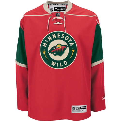
Minnesota Wild: This was my favorite 3rd jersey last year, now it's one of the best home jerseys in the game. A modern classic.
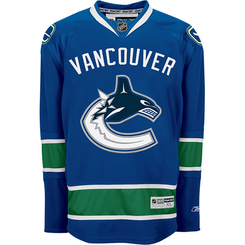
Vancouver Canucks: While the front of the jersey is a little busy, I love what they went for here. Also, their color scheme is great.
Columbus Blue Jackets: Yes, Columbus has a hockey team, and yes, they look great.

THE BAD
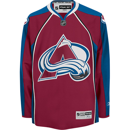
Colorado Avalanche: I just hate those front stripes. Paul Lukas is right, they look like apron strings...
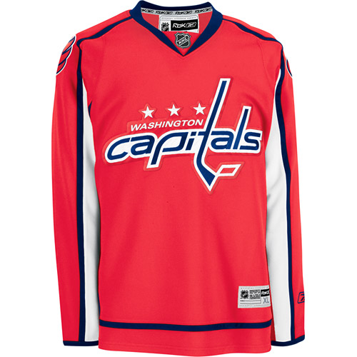
Washington Capitals: Does this look like a smock to anyone else?
THE UGLY
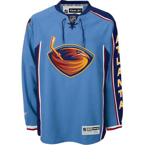
Atlanta Trashers: What the hell is going on here? Just a busy, asymmetrical mess...
Buffalo Sabres: Technically, this redesign happened last season, but that toupee with horns so damn ugly, it merited another mention. Yuck!

You can check out all the new NHL designs here. Enjoy!
|
